SaaS Hero , Dark with Video Loop Fade, Liquid Glass Nav & Logo Marquee
Dark SaaS hero with smooth video fade-in/out loop (no libraries), liquid glass navbar and buttons, massive gradient
When to use
Use for talent platforms, HR tech, AI recruitment tools, or any growth-focused SaaS where
Recommended LLMs
Plugins / Skills
When to use
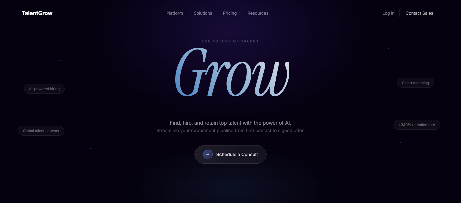
The signature element here is the single-word gradient headline "Grow" at 230px font size — used as a visual statement, not just text. Combined with the video that fades in and out (no overlay, pure JS opacity control via requestAnimationFrame), the result looks like a high-budget site.
What you'll need to customise
- Video URL — swap the CloudFront MP4
- Single-word headline — "Grow", "Scale", "Ship", "Build" — whatever your core verb is
- Sub-copy — two lines below the headline
- Logo marquee — replace placeholder brand names with actual client logos
- Font — "General Sans" from Fontshare; swap to your heading font
Tips for best results
- The video fade uses
requestAnimationFrame— no Framer Motion needed, keeping it lightweight - The
.liquid-glassutility class must be in@layer utilitiesin your CSS — not as a Tailwind plugin - The
marqueeanimation is a pure CSS keyframe (not a library) —translateX(0%) → translateX(-50%) - The gradient headline uses
background-image: linear-gradient(223deg, #E8E8E9 0%, #3A7BBF 104.15%)— not a Tailwind gradient
Expected output
Complete files: index.css (design tokens + liquid-glass utility + marquee keyframe), tailwind.config.ts (color tokens + marquee animation), HeroSection.tsx, SocialProofSection.tsx (with logo marquee)
The Prompt
Copy it, paste it, use it.
Build a dark-themed landing page hero with navbar, headline, CTA button, fade-looping video, and logo marquee. Use React + Vite + Tailwind CSS + TypeScript + shadcn/ui. Install `@fontsource/geist-sans`.

### Step 1 — `index.css` Design Tokens

Single dark theme only (no light mode). Add to `:root`:
```css
--background: 260 87% 3%;
--foreground: 40 6% 95%;
--card: 240 6% 9%;
--card-foreground: 40 6% 95%;
--popover: 240 6% 9%;
--popover-foreground: 40 6% 95%;
--primary: 262 83% 58%;
--primary-foreground: 0 0% 100%;
--secondary: 240 4% 16%;
--secondary-foreground: 40 6% 95%;
--muted: 240 4% 16%;
--muted-foreground: 240 5% 65%;
--accent: 262 83% 58%;
--accent-foreground: 0 0% 100%;
--border: 240 4% 20%;
--input: 240 4% 20%;
--ring: 262 83% 58%;
--radius: 0.75rem;
--hero-heading: 40 10% 96%;
--hero-sub: 40 6% 82%;
```

Body font: Geist Sans. Import weights 400, 500, 600, 700:
```css
@import "@fontsource/geist-sans/400.css";
@import "@fontsource/geist-sans/500.css";
@import "@fontsource/geist-sans/600.css";
@import "@fontsource/geist-sans/700.css";
```

### Step 2 — Liquid Glass Utility (add in `@layer utilities`)
```css
.liquid-glass {
  background: rgba(255, 255, 255, 0.01);
  background-blend-mode: luminosity;
  backdrop-filter: blur(4px);
  -webkit-backdrop-filter: blur(4px);
  border: none;
  box-shadow: inset 0 1px 1px rgba(255, 255, 255, 0.1);
  position: relative;
  overflow: hidden;
}
.liquid-glass::before {
  content: '';
  position: absolute;
  inset: 0;
  border-radius: inherit;
  padding: 1.4px;
  background: linear-gradient(180deg,
    rgba(255,255,255,0.45) 0%, rgba(255,255,255,0.15) 20%,
    rgba(255,255,255,0) 40%, rgba(255,255,255,0) 60%,
    rgba(255,255,255,0.15) 80%, rgba(255,255,255,0.45) 100%);
  -webkit-mask: linear-gradient(#fff 0 0) content-box, linear-gradient(#fff 0 0);
  -webkit-mask-composite: xor;
  mask-composite: exclude;
  pointer-events: none;
}
```

### Step 3 — `tailwind.config.ts`
- Map all CSS tokens to `hsl(var(--token))`
- Add `hero.heading` and `hero.sub` color group
- Add marquee keyframe: `0% { transform: translateX(0%) }` → `100% { transform: translateX(-50%) }`
- Animation: `marquee: "marquee 20s linear infinite"`

### Step 4 — shadcn Button Variants
In `components/ui/button.tsx`, add:
```ts
hero: "bg-primary text-primary-foreground rounded-full px-6 py-3 text-base font-medium hover:bg-primary/90",
heroSecondary: "liquid-glass text-foreground rounded-full px-6 py-3 text-base font-normal hover:bg-white/5"
```

### Step 5 — Navbar
- Full width, `py-5 px-8`, `flex justify-between`
- Left: logo image (`src/assets/logo.png`, 32px height)
- Center: "Features" (with ChevronDown), "Solutions", "Plans", "Learning" (with ChevronDown) — `text-foreground/90 text-base gap-1`
- Right: "Sign Up" button with `heroSecondary` variant, `size="sm" rounded-full px-4 py-2`
- Below navbar: `mt-[3px] w-full h-px bg-gradient-to-r from-transparent via-foreground/20 to-transparent`

### Step 6 — Hero Section
- `bg-background relative overflow-hidden`
- Contains Navbar at top
- Below navbar + divider: `pt-20 px-4 flex flex-col items-center text-center`

**Headline "Grow":**
- `text-[230px] font-normal leading-[1.02] tracking-[-0.024em]`
- Font family: `'General Sans', sans-serif` (load from Fontshare)
- Gradient text: `background-image: linear-gradient(223deg, #E8E8E9 0%, #3A7BBF 104.15%); -webkit-background-clip: text; color: transparent`

**Subtext (two lines with `<br>`):**
- "The most powerful AI ever deployed" / "in talent acquisition"
- `text-hero-sub text-center text-lg leading-8 max-w-md mt-4 opacity-80`

**CTA Button:**
- `heroSecondary` variant, "Schedule a Consult", `px-[29px] py-[24px]`, `mt-8 mb-[66px]`

### Step 7 — Social Proof + Video Section

**Background Video (with manual fade loop):**
- URL: `https://d8j0ntlcm91z4.cloudfront.net/user_38xzZboKViGWJOttwIXH07lWA1P/hf_20260308_114720_3dabeb9e-2c39-4907-b747-bc3544e2d5b7.mp4`
- `absolute inset-0 w-full h-full object-cover` — initial `style={{ opacity: 0 }}`
- Fade logic using `requestAnimationFrame`:
  - Fade in over 0.5s at start (read `currentTime`)
  - Fade out over 0.5s before `duration` ends
  - On `ended`: set opacity to 0, wait 100ms, `currentTime = 0`, `play()`
- Gradient overlays: `absolute inset-0 bg-gradient-to-b from-background via-transparent to-background`

**Content (z-10):** `flex flex-col items-center pt-16 pb-24 px-4 gap-20`
- `h-40` spacer div

**Logo Marquee (max-w-5xl):**
- Left: "Relied on by brands / across the globe" — `text-foreground/50 text-sm whitespace-nowrap shrink-0`
- Right: horizontally scrolling `animate-marquee` strip
- Logos: Vortex, Nimbus, Prysma, Cirrus, Kynder, Halcyn — duplicated for seamless loop
- Each logo: `liquid-glass w-6 h-6 rounded-lg` square (first letter) + brand name `text-base font-semibold text-foreground`
- `gap-16` between logos

### Step 8 — Page Composition
`index.tsx` renders: `<HeroSection />` then `<SocialProofSection />` — no wrapper styling.