Dev & CodeFreev1.0
SaaS Hero , Dark with HLS Video, Glass Navbar, Integration Badges & Logo Marquee
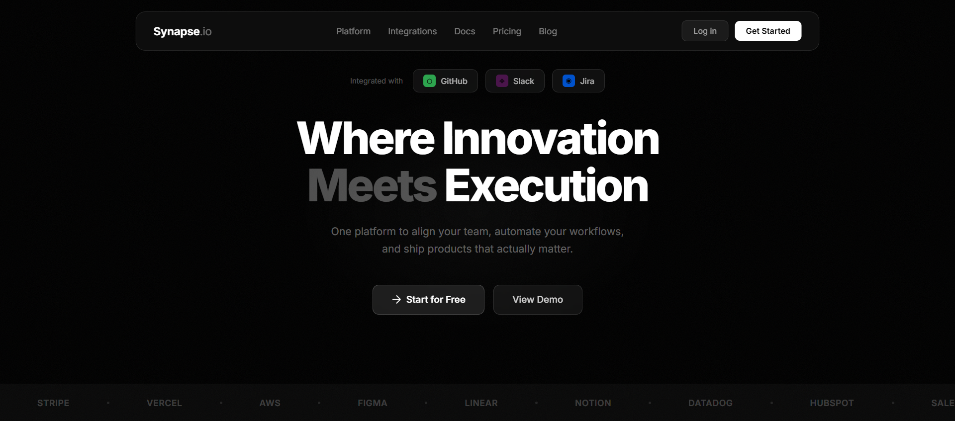
Dark SaaS hero with Mux HLS video (floating behind content), glass blur navbar with gradient-border active link, 3 integration badges, staggered animations, and grayscale logo marquee.
saasheroreacttailwindclaudechatgptlovablecursorhlsframer-motiondark-thememarqueeglassmorphism
When to use
Use for analytics platforms, developer tools, enterprise SaaS, or any B2B product that needs to signal seriousness and technical depth.
Recommended LLMs
Claude SonnetGPT-4o
Plugins / Skills
Projects (Claude)Artifacts (Claude)
When to use
The unique layout here is the video positioning — instead of full-bleed, it's height: 80vh floating at bottom: 35vh, creating a "window into the background" effect while keeping the top of the hero clean black. The three "Integrated with" badges signal ecosystem compatibility immediately.
What you'll need to customise
- Video URL — swap the Mux HLS stream
- Integration badges — replace placeholder icons with your actual integrations (Slack, GitHub, Figma, etc.)
- Headline — "Where Innovation Meets Execution"
- Logo marquee — use your actual customer/partner logos (grayscale, 40% opacity)
- Navbar — "Features" active state has a gradient border bottom — this is the only nav element with a visible state indicator
Tips for best results
- The video is NOT full-bleed:
h-[80vh] absolute bottom-[35vh]— this keeps the top portion of the hero clean - Build
VideoPlayeras a memoized component usinguseMemoto prevent re-renders - The gradient border on the active "Features" link uses a pseudo-element trick:
border-b border-transparentwith a gradient viabackground-imageon the border - The "Case Studies" nav link has
line-throughdecoration — a subtle irreverent detail - Logo marquee logos should be
grayscale opacity-40
Expected output
React component with:
- Fixed glass navbar (blur bg, gradient-border active link, strikethrough link)
- Pure black hero background
- HLS video floating at 80vh height, positioned at bottom-35vh
- 3 glass "Integrated with" badges
- Staggered Motion: badges → headline → subtitle → buttons
- Grayscale logo marquee at bottom
The Prompt
Copy it, paste it, use it.
Build a high-fidelity dark-themed hero section using React, Tailwind CSS, and `motion/react`.

### Tech Stack
- React + TypeScript
- Tailwind CSS
- `motion/react` (Framer Motion v11+)
- hls.js
- lucide-react

### Background Color
- Pure black `#000000` throughout

### Background Video (memoized `VideoPlayer` component)
- Source: `https://stream.mux.com/9JXDljEVWYwWu01PUkAemafDugK89o01BR6zqJ3aS9u00A.m3u8`
- HLS.js implementation. Safari fallback. Cleanup `hls.destroy()` on unmount.
- `loop muted autoPlay playsInline` — 100% opacity, no overlays
- Position: `absolute bottom-[35vh] left-0 right-0 h-[80vh]` — NOT full-bleed
- `object-cover w-full h-full`

### Navbar (fixed, glass)
- `fixed top-0 w-full z-50 backdrop-blur-sm bg-black/60`
- `flex items-center justify-between px-8 py-4`

**Logo:** "Synapse" — `font-medium tracking-tight text-white`

**Links:**
- "Features" — **active state**: `border-b border-transparent` with a gradient underline using `background-image: linear-gradient(90deg, #fff, #888); background-size: 100% 1px; background-repeat: no-repeat; background-position: bottom`
- "Insights", "About" — standard white links
- "Case Studies" — `line-through text-white/50`
- "Contact" — standard

**CTA:** "Get Started for Free" — `bg-gradient-to-r from-white to-gray-300 text-black rounded-full px-5 py-2 text-sm font-medium`

### Hero Content (centered, `z-10 relative`)

**Integration Badges (row of 3, gap-3):**
- Each: `glass-badge` style — `bg-white/5 backdrop-blur-sm border border-white/10 rounded-full px-4 py-2 flex items-center gap-2`
- Text: "Integrated with" — `text-sm text-white/60`
- Icon: a colored 20×20 square placeholder (use colored `div` with brand color — e.g., Slack purple, GitHub gray, Figma green)
- Motion: `initial={{ opacity: 0, y: 20 }} animate={{ opacity: 1, y: 0 }}` staggered

**Headline:**
- "Where Innovation Meets Execution"
- `text-[80px] font-semibold tracking-tight leading-[1.05] text-white`
- Fade-in-up: `initial={{ opacity: 0, y: 30 }} animate={{ opacity: 1, y: 0 }} transition={{ delay: 0.2, duration: 0.7 }}`

**Subtext (2 lines):**
- "Test your ideas in hours, not months." / "Deploy with confidence, iterate at the speed of thought."
- `text-white/60 text-lg max-w-xl text-center leading-relaxed`
- Motion: `delay: 0.35`

**Buttons (row, gap-4):**
- Primary: "Get Started for Free" — `bg-white/5 border border-white text-white rounded-full px-6 py-3`
- Secondary: "Let's Get Connected" — `bg-white/10 backdrop-blur-sm border border-white/20 text-white rounded-full px-6 py-3`
- Motion: `delay: 0.5`

### Logo Marquee (bottom of hero)
- Horizontal scrolling strip
- Logos: 6 placeholder SVGs (use gray rectangles of varying widths)
- `grayscale opacity-40`
- CSS animation: `translateX(0%) → translateX(-50%) 30s linear infinite`
- Duplicate the set for seamless loop